Getting started with Tailwind CSS
appstonelab
May 24, 2022

What is tailwind CSS?
TailwindCSS is a utility-first CSS framework. This implies that they are primarily focused on utilities. They provide utility classes like flex, pt-4, bg-orange-100, and rotate-90 that can be combined for building modern user-friendly UI components. Their purpose isn’t necessarily to define your component’s appearance. Using the different classes they provide, you decide what to do.
Why Tailwind CSS?
An experienced CSS framework user or a total beginner might ask this question. Tailwind allows for full customization, allows the use of utility classes, and is a very low-level and basic CSS framework for anyone interested in using it. A total beginner in CSS can pick this up and get familiar with it in a very short time. Here are some reasons to choose TailwindCSS:
- Easily understandable CSS class name.
- Easy to remember the class name.
- Suitable for beginners.
- No restrictions on how the name can be used.
- Totally customizable – Overwrite styles without SASS or LESS.
- Utility-first classes. Without leaving your HTML, Tailwind allows you to construct a fully functioning website frontend.
Prerequisites:
- Basic CSS.
- Basic HTML.
- Basic command-line knowledge
Installation and configuration
1. Using CDN :
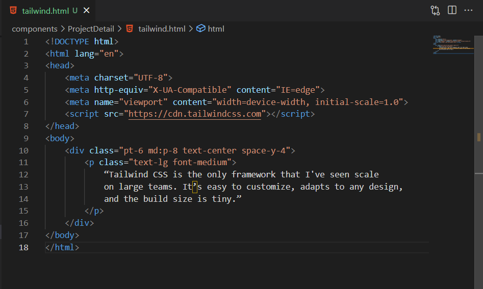
1.1. Add the CDN script tag to the HTML head
The CDN script tag should be placed in the < head > of your HTML file, and you can use Tailwind’s utility classes for styling content.
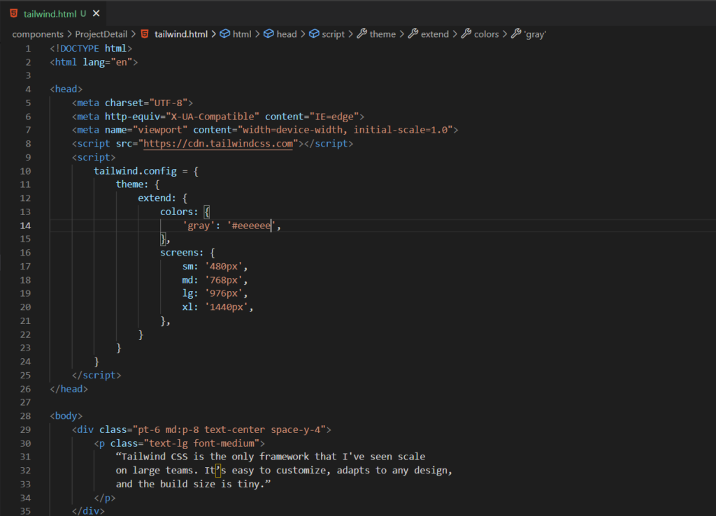
1.2. Customize the config:
Edit the tailwind.config object to customize configuration with, your own design changes
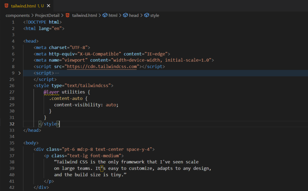
1.3 Add Custom CSS:
Use type="text/tailwindcss" to add custom CSS in style tag
2. Using NPM:
2.1. Install a package with NPM</h4
Run in your terminal:
npm install tailwind css
2.2. Add Tailwind to your CSS
Add tailwind directives to your CSS file
@tailwind base;
@tailwind components;
@tailwind utilities;
2.3 Create your tailwind config file
This is not a compulsory step. But this step allows you to set default values. Tailwind will produce the right CSS based on this configuration.
npx tailwindcss init
The above code will generate a template config file similar to this:
module.exports = {
purge: [],
theme: {
extend: {},
},final
variants: {},
plugins: [],
}
Refer to this documentation for more details about the configuration.
Use of tailwind utility classes
Here are some examples of how Tailwind’s utility classes work:
h-screen: It gives the entire viewport height to the element.text-orange-300: adds a light orange color (color: rgb(253, 186, 116);). 200 adds something lighter and 400, something darker.bg-gray-100: adds a background color to light gray (#f7fafc).md:text-gray-400: adds a media query for an element such that screen equal to the medium screen or greater than the width (768px by default) applies a light gray (#cbd5e0) to the element.hover: underline: adds an underline to an element when it hovered on.md:text-xl: this relates to a media inquiry for a component such that a font size of 1.25rem is utilized for an element when the screen thickness is greater than or equal to the medium display (768px by default).mt-0: executes a margin-top of 0 to a component.
Key benefits of using Tailwind CSS
1. Provides access to your design system through an API. (Constraint-based)
Instead of littering your stylesheets with arbitrary values, utility classes allows you to work within constraints. It is easy to be coherent with color preferences, spacing, typography, shadows, and everything else that goes into a well-engineered design system.
2. You can build whatever you want. (Build anything)
Tailwind is so low-level that it never encourages you to design the same site twice. The same component can be built completely differently in the next project even with an identical color palette and size scale.
3. You’ll never have to ship unused CSS again. (Performance)
When you build for production, Tailwind automatically removes all the unused CSS, so your final CSS bundle is as small as possible. The majority of Tailwind projects transmit less than 10kB of CSS to the client.
4. Everything is responsive. (Mobile-first)
Tailwind lets you build responsive designs directly in your HTML instead of wrestling with complex media queries in your CSS.You can apply a screen size to any utility class and see it magically apply at a specific breakpoint.
5. Hover and focus states? Yes, we have them. (State variants)
Do you want to style something on hover? Add hover: at the beginning of the class you wish to add. It functions for centre, active, paralyzed, focus-within, and focus-clear, we invented ourselves, like group-hang.
6. Upset about duplication? Don’t be. (Component-driven)
Still, all you have to do is cost them into an element or template partial and smash — you’ve got a single source of variety so you can make changes in one place, If you are repeating the same serviceability over and over again.
7. Not into component frameworks? (Component-driven)
If you like to keep it old, use the Tailwind @apply directive to prune repeated mileage patterns into custom CSS classes just by copying and pasting the list of class names.
8. Now with Dark Mode. (Dark Mode)
Don’t aim to be one of those websites that covers people when they open it on their phone at 2 am? Enable dark mode in your configuration train and also throw dark in front of any color mileage to apply it when dark mode is active. Workshop for background colors, textbook colors, border colors, and indeed slants.
9. Extend it, tweak it, change it. (Customization)
Tailwind includes a consummately drafted set of defaults out-of-the-box, but literally, everything can be customized — from the color palette to the distance scale to the box murk to the mouse cursor. Use the tailwind.config.js train to draft your own design system, also let Tailwind transfigure it into your own custom CSS frame.
10. Cutting-edge is our comfort zone. (Modern features)
Tailwind is unapologetically ultramodern and takes advantage of all the rearmost and topmost CSS features to make the inventor experience as pleasurable as possible. We have first-class CSS grid support, composable transforms and slants powered by CSS variables, support for ultramodern state pickers like :focus-visible, and tons more.
11. World- class IDE integration. (Editor tools)
Upset about remembering all of these class names? The Tailwind CSS IntelliSense extension for VS Code has you sheltered. Get intelligent autocomplete suggestions, linting, class delineations, and further, all within your editor and with no configuration needed.
12. Move Indeed briskly with Tailwind UI. (Ready-made components)
Tailwind UI is a collection of beautiful, completely responsive UI factors, designed and developed by us, the generators of Tailwind CSS. It’s got hundreds of ready-to-use examples to choose from and is guaranteed to help you find the perfect starting point for what you want to make.
Related Blogs
UX Design
appstonelab
May 24, 2022

App DevelopmentSaaS
appstonelab
May 24, 2022

SaaSWeb Development
appstonelab
May 24, 2022
